
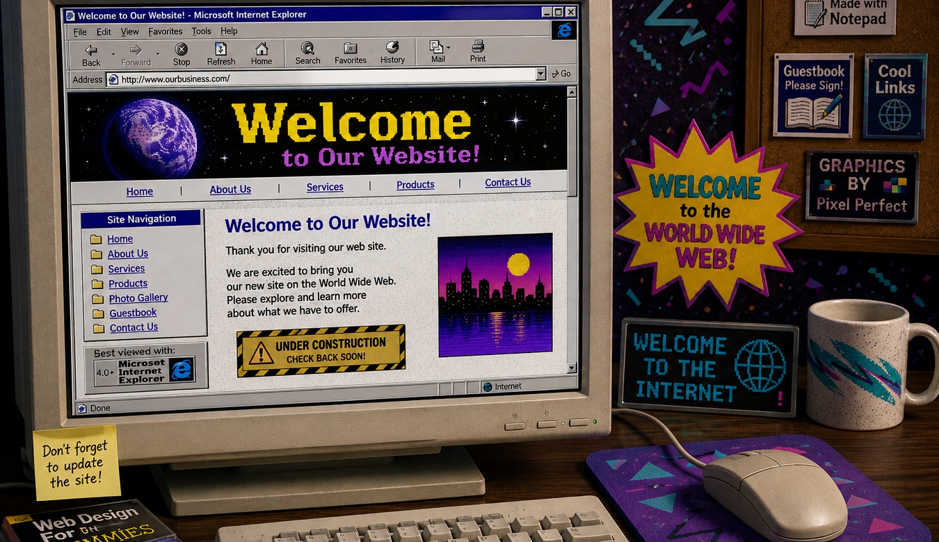
There is something wonderfully nostalgic about the early web. Tiny pixel icons. Bright blue underlined links. Visitor counters. Star-field backgrounds. Tables inside tables inside more tables. Maybe even a little “Best Viewed in Internet Explorer” badge for good measure. That era helped create the internet we use today. It belongs in a museum, a retro computer collection, or a fun design experiment. It probably should not be running the digital front door of your business.
A website does not need to follow every design trend, and “old” does not automatically mean bad. Some websites age beautifully because they were built around strong typography, clear information, sensible navigation, and a timeless brand. The problem begins when an older website starts making the business itself feel outdated.
Your customers may never say, “This site uses an outdated interface pattern.” They simply feel something is off. The company seems less active. The navigation feels awkward. The text is difficult to read. The site is frustrating on a phone. The pages take too long to load. They wonder whether the information is current — and sometimes whether the business is still operating.
1. Your Website Has Started Showing Its Age
Website design changes because the way people use technology changes. Twenty years ago, desktop monitors were smaller, mobile browsing was primitive, broadband was less universal, and websites were often designed as fixed-width pages. Today a visitor may arrive on a large desktop display, a laptop, a tablet, or a phone held in one hand while standing in a parking lot.
If your site still has tiny text, narrow fixed columns, miniature buttons, dated gradients, cluttered sidebars, low-resolution graphics, or navigation designed for a mouse rather than a finger, the issue is not simply fashion. The design is no longer aligned with the way customers use the web.
Your customers should remember your business — not the fact that your website reminded them of the computer lab in 1998.
2. An Old Website Can Quietly Damage Trust
People make remarkably fast judgements online. Before they read your company history or compare your services, they are already forming an impression from the design, photography, typography, spacing, navigation, and overall polish of the site.
Imagine two businesses offering the same service. One has a clean website with current information, strong photography, easy navigation, clear calls to action, and a professional mobile experience. The other has a site that looks untouched for twelve years. Even if the second company is excellent, the first one often feels safer to contact.
That is the uncomfortable part of outdated design: it can make a good business look less capable than it really is. Your website should close the credibility gap, not create one.
3. If Mobile Feels Like a Punishment, Redesign
Pinching and zooming should not be part of your customer journey. Neither should turning the phone sideways to read a paragraph, hunting for a microscopic menu, or accidentally tapping the wrong link because every button is packed together.
A modern responsive site is designed to adapt. Content stacks intelligently. Type remains readable. Navigation becomes touch-friendly. Images crop appropriately. Forms are usable. Calls to action remain visible without taking over the entire screen.
Mobile design is no longer an optional enhancement added after the desktop version. For many businesses, the phone is where the first impression happens.
4. Outdated Design Can Become an SEO Problem
Search engine optimization is not determined by whether your website looks fashionable. Search engines do not award rankings because your buttons have tasteful rounded corners. But many problems common to aging websites overlap directly with factors that affect search visibility and user experience.
Older sites may be slow, difficult to use on mobile devices, poorly structured, filled with obsolete code, missing useful headings, running outdated software, or organized around pages that no longer match what customers search for.
A redesign creates an opportunity to improve the foundation: cleaner page structure, stronger service content, logical URLs, internal linking, descriptive titles, useful headings, optimized images, improved performance, and a mobile-first experience.
There is one warning: redesigning without an SEO migration plan can also hurt rankings. Existing URLs, redirects, valuable content, metadata, and indexed pages need to be considered. A professional redesign should protect what is working while improving what is not.
5. Your Website Should Not Need a Coffee Break to Load
Older websites are not always slow, and newer websites are not automatically fast. In fact, a badly built modern site can be impressively sluggish. But years of additions can weigh a site down.
Plugins accumulate. Images get uploaded without optimization. Tracking scripts multiply. Old themes carry compatibility code. Databases collect leftovers. Hosting that was adequate years ago may now be underpowered for what the site has become.
A redesign is a chance to question everything. Do we still need this plugin? Why are we loading this script? Is this image three times larger than the space displaying it? Does this page need six animations to explain one service?
Speed should feel natural. Visitors should spend their time reading about your business, not admiring the loading spinner.
6. Your Business Changed, but the Website Did Not
This may be the clearest sign that a redesign is overdue. Businesses evolve. Services change. Teams grow. Markets shift. Branding improves. New locations open. Old offerings disappear. The website often gets patched along the way until it becomes a collection of different eras.
The homepage says one thing. The About page says another. A service nobody offers anymore is still in the menu. The newest service is buried in a paragraph added three years later. The footer has an old phone number. Nobody is completely sure which contact form goes where.
A redesign lets you stop patching and reorganize the site around the business that exists today.
7. Good UI Should Make the Website Feel Obvious
User interface design is not about decorating buttons. It is about helping people understand what they can do and where they should go.
Older sites often grew without a consistent design system. One page uses green buttons. Another uses blue text links. The Contact button is in a different location on every page. Headings change size randomly. Important information looks exactly like secondary information.
A modern redesign establishes hierarchy and consistency. Visitors learn the interface without consciously thinking about it. The important things look important. Actions look clickable. Navigation behaves predictably. That reduction in mental effort makes the entire company feel more organized.
8. Lots of Traffic but Few Enquiries? Look at the Experience
A website can attract visitors and still fail as a business tool. If people arrive but rarely contact you, request a quote, book, buy, or take the next step, the issue may be the experience rather than the amount of traffic.
Maybe the call to action is hidden. Maybe the service description is vague. Perhaps the contact form feels like a mortgage application. Maybe there is no proof, no project examples, no clear location information, or no explanation of what happens after someone contacts you.
Redesigning around conversion means asking what a visitor needs at each stage and making the next step clear without turning the website into one giant flashing sales button.
9. Your Website No Longer Matches Your Brand
You may have updated your logo, signage, vehicles, office, photography, or marketing materials while the website remained frozen in time. That disconnect makes the brand feel fragmented.
Your website should be one of the strongest expressions of the brand because it combines colour, typography, imagery, language, movement, and interaction. When all of those pieces feel intentional, the business becomes more memorable.
If your physical business says “professional, established, current” while the website says “we found this template on a CD-ROM,” the website is underselling you.
10. The Site Has Become Difficult to Maintain
Sometimes the visitor-facing design is only half the problem. Behind the scenes, an old website can become increasingly awkward to manage. The theme may be abandoned. PHP compatibility may be limited. Plugins may depend on old code. Nobody wants to update anything because one change could break three unrelated pages.
That is technical debt. Eventually, the cost of carefully preserving an aging system becomes greater than replacing it with a cleaner foundation.
A redesign can simplify administration, reduce unnecessary dependencies, improve editing workflows, and make future maintenance far less stressful.
11. Do Not Redesign Just to Chase Trends
Not every website needs a redesign because a new visual trend appeared on social media. Giant typography, glass effects, unusual scrolling, 3D objects, and experimental layouts can be exciting, but they are not automatically right for a law firm, contractor, community organization, or local retailer.
The goal is not to make the site look like 2026 for twelve months and then look dated again. The goal is to create a modern, flexible design rooted in the brand and the needs of its customers.
Good redesigns use trends selectively. Great redesigns still make sense after the trend has moved on.
12. The Quick “Is It Time?” Test
Open your website on your phone and pretend you have never seen it before. Can you tell what the company does within a few seconds? Can you find the main services? Is the text comfortable to read? Can you contact the business without hunting? Do the photos look current? Does the site feel as professional as the company?
Then compare it with the websites of several strong competitors. You do not need to copy them. You are looking for the experience customers are being trained to expect.
If you regularly apologize for the site, explain that it is “being updated soon,” or avoid putting the address on marketing material, you probably already know the answer.
13. What a Redesign Should Actually Improve
A redesign should be more than a fresh coat of paint. Start with the structure. What pages are needed? What can be removed? What questions do customers ask? Which services matter most? Where should visitors go next?
Then address content, mobile usability, accessibility, search structure, performance, imagery, forms, security, analytics, hosting, and ongoing maintenance. The visual design brings those decisions together into an experience that feels cohesive.
This is why simply installing a new theme is not always a redesign. If all of the old problems are poured into a prettier template, you have redecorated the problem.
14. How ANJ Design Can Bring Your Website Into the Present
ANJ Design can review an existing website from both the design and technical sides. We look at how the site represents the business, how visitors move through it, how it behaves on mobile devices, how quickly it loads, how the content is structured, and whether the underlying technology is still appropriate.
A redesign can preserve the useful parts of the existing site while replacing what is holding it back. That may include a new visual system, clearer navigation, stronger calls to action, refreshed content structure, better imagery, responsive layouts, performance improvements, SEO-conscious migration, and a cleaner WordPress foundation.
Most importantly, the new website should feel like your business now — not your business ten or twenty years ago.
15. You Can Keep the 90s Playlist. The Website Can Move On.
Keep the old computer. Keep the vintage game console. Keep the music, the neon colours, and the memories of waiting for a single photograph to download line by line over dial-up.
But if your business website is still carrying the limitations of that era — or even just the design habits of a decade ago — it may be costing you credibility, usability, search opportunities, and enquiries.
A redesign is not about pretending your business is something new. It is about making sure the website finally reflects how good the business already is.
Your customers have moved forward. Their devices have moved forward. Search has moved forward. Your website can too.
ANJ Design can review your current site and show you where design, mobile usability, performance, SEO, and technology can be improved — without losing what already works.