
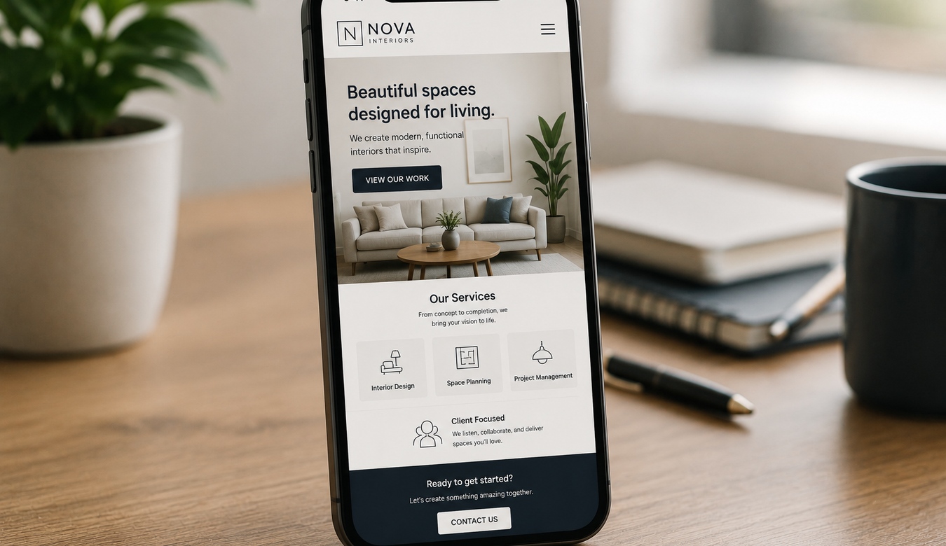
Pull out your phone and think about the last few websites you visited. Maybe you checked a restaurant, looked up a contractor, read a news article, searched for a product, found a phone number, or compared two businesses while sitting in a parking lot.
That is why mobile-first design still matters in 2026. A mobile website is not a smaller version of the “real” desktop site. For many customers, it is the real website.
Designing mobile-first means thinking seriously about that experience from the beginning: what people need first, what fits comfortably on a small screen, what should load quickly, what should be easy to tap, and what can be removed because it is simply getting in the way.
1. Customers Do Not Browse in Perfect Conditions
Designers often build websites on large monitors with fast connections and plenty of room. Customers may be standing outside, using one hand, dealing with glare, connected through mobile data, and trying to find one piece of information before a meeting starts.
Mobile-first design respects that reality.
When space is limited, the website has to decide what matters most. That discipline often makes the entire site better.
2. Responsive Does Not Automatically Mean Mobile-Friendly
A website can technically resize to a phone and still provide a poor mobile experience. Text may become tiny. Buttons may sit too close together. Huge images may dominate the screen. Popups may cover the content. A desktop navigation menu may collapse into something confusing.
Responsive code is the foundation. Mobile-friendly design requires someone to actually use the page at mobile sizes and make thoughtful decisions.
The question is not only “Does it fit?” It is “Does it feel good to use?”
3. Speed Feels Even More Important on a Phone
A customer on a mobile connection may not have the same network conditions as someone sitting at an office desk. Oversized photography, unnecessary video, dozens of scripts, heavy animation, and poorly optimized plugins can make a page feel painfully slow.
Mobile-first thinking encourages designers and developers to question every heavy element. Does this contribute enough to justify the cost of loading it?
Fast does not have to mean visually boring. It means spending the performance budget on the things customers actually benefit from.
4. Websites Need to Work With Thumbs, Not Mouse Pointers
A mouse pointer is precise. A thumb is not.
Links, menu items, form controls, buttons, and other interactive elements need comfortable spacing and useful tap areas. Important actions should not require somebody to perform fingertip surgery between two tiny links.
Good mobile design also considers where controls appear and how far a person has to reach while holding a device naturally.
5. Mobile Forces Better Content Decisions
On a desktop, it is easy to fill empty space simply because it exists. Mobile exposes that habit immediately.
Long introductions, repeated marketing phrases, oversized decorative headings, unnecessary sidebars, and endless blocks of content can become exhausting on a narrow screen.
Mobile-first content asks: What does the customer need to understand? What question are we answering? What should they do next?
That clarity usually improves desktop pages too.
6. Make It Ridiculously Easy to Contact the Business
One of the biggest advantages of mobile browsing is that the device is already a phone.
If somebody wants to call, the phone number should be easy to find and tap. If they want directions, the address should be useful. If they want to email, the path should be obvious. If a form is necessary, keep it comfortable enough to complete without fighting twenty fields.
For a service business, a strong mobile page may simply need to answer three things quickly: Do you provide what I need? Can I trust you? How do I contact you?
8. Forms Deserve Special Attention
Forms are where many mobile experiences fall apart. Fields can be too small, error messages unclear, labels disappear, keyboard types are wrong, and users are asked for information the business does not really need.
Every extra field creates another opportunity for someone to decide, “I'll do this later.” Later may never arrive.
Ask only for what is useful, make errors easy to correct, and test the form on an actual phone.
9. Mobile Quality Affects Trust
If a business website looks polished on a desktop but broken on a phone, customers do not think, “Their desktop breakpoint is probably excellent.” They think the website is broken.
Images cut off awkwardly, text overlaps, buttons disappear, and horizontal scrolling can make an otherwise professional company feel neglected.
A clean mobile experience signals that the business understands how customers actually interact with it.
10. Mobile Experience and Search Belong in the Same Conversation
Search engines have long placed significant emphasis on mobile versions of websites. But even beyond technical search considerations, mobile usability affects what happens after somebody reaches the page.
Search visibility is not very valuable if the visitor arrives and immediately leaves because the page is slow or impossible to use.
SEO gets people to the door. User experience helps convince them to stay.
11. Mobile-First Does Not Mean Desktop-Second-Class
This is important. Designing mobile-first does not mean desktop should look like a giant stretched phone.
Large screens create opportunities for richer layouts, wider photography, multiple columns, stronger editorial composition, and more immersive interactions.
The goal is to begin with the essential experience and progressively use the space available. Each screen size should feel intentionally designed for itself.
12. Test Your Own Website Like a Customer
Open your website on your phone — not in an editor, not in a desktop preview. Use the actual site.
Can you understand what the business does without zooming? Can you open the menu? Can you tap the phone number? Does the contact form work? Are there giant empty spaces? Does a popup trap you? Do images look sharp without taking forever to load?
If you find yourself getting annoyed, your customers may be experiencing the same thing.
13. How ANJ Design Can Help
If your website looks good on a computer but falls apart on a phone, ANJ Design can review the mobile experience and identify where it needs improvement.
We can look at responsive layouts, navigation, typography, image sizing, performance, forms, calls to action, mobile spacing, WordPress behaviour, and the overall journey customers take through the site.
Sometimes a few focused fixes can make a dramatic difference. Other times an older site needs a broader responsive redesign. We can help determine which makes sense.
Call us or send us an email. Tell us what looks wrong — or simply ask us to take a look. We're here to help.
14. Your Website Should Feel at Home in Someone's Hand
Mobile-first design is not about chasing a trend. It is about meeting customers where they already are.
They are searching from phones, reading from phones, comparing businesses from phones, filling forms from phones, and calling companies directly from the page they just found.
A great mobile experience removes friction from all of those moments.
If you have not looked closely at your own mobile site lately, now is a good time. And if something feels off, call or email us. We'll be happy to help make it better.
Call or email ANJ Design. We can review the mobile experience, explain what is working and what is not, and help make your site easier for customers to use.