Design trends are a little like clothes. Some arrive, dominate everything for a season, and then become a very specific reminder of the year they were popular. Others settle in, lose the “trend” label, and become part of the visual vocabulary designers keep using because they simply work.
In 2026, the most interesting graphic design is not necessarily chasing whatever appeared on a mood board last week. Many of the strongest visual directions are ideas we have seen before — refined, simplified, mixed with newer technology, and used with more intention.
That is good news for businesses. A brand does not need to reinvent itself every twelve months to remain current. The goal is to understand which ideas have staying power and which ones are likely to make today's marketing look dated tomorrow.
1. Timeless Design Is Not Boring Design
There is a misconception that avoiding short-lived trends means everything has to become beige, minimal, and painfully safe. Timeless design can be colourful, expressive, unusual, and full of personality.
What makes it age well is usually the reasoning behind it. Strong hierarchy, readable typography, balanced composition, meaningful colour, and appropriate imagery remain useful even as visual fashions change.
The strongest work feels appropriate to the brand first and fashionable second.
2. Big, Confident Typography Is Still Working
Large typography has been prominent for years, and it continues to age well when it serves a purpose. A strong headline can create hierarchy immediately, reduce visual clutter, and give a brand a recognizable voice.
The difference between timeless and trendy often comes down to restraint. One confident headline can be powerful. Making every sentence enormous because “big type is in” quickly becomes exhausting.
Typography works best when it creates rhythm: bold moments balanced by comfortable reading.
3. Retro Influence Keeps Coming Back for a Reason
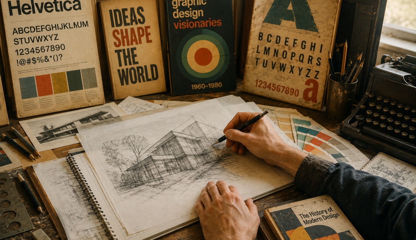
Designers continue to borrow from the 60s, 70s, 80s, 90s, and early digital era because those periods contain rich visual languages. Warm palettes, geometric forms, hand-drawn lettering, grain, pixel references, editorial typography, and vintage illustration can create immediate personality.
The trick is interpretation rather than imitation. A business probably does not need its entire website to look like a 1997 desktop. But a subtle pixel detail, vintage colour relationship, or historical type influence can make a modern identity feel distinctive.
Nostalgia works when it creates emotion without sacrificing usability.
4. Natural, Imperfect Texture Feels More Valuable Than Ever
As digital tools become better at producing perfectly smooth imagery, human imperfections have become increasingly appealing. Paper texture, pencil marks, ink, grain, imperfect edges, collage, photography, and hand-made details introduce warmth.
These elements remind us that somebody made a choice rather than simply selecting a preset.
That does not mean covering every design in artificial film grain. Texture should support the message. A little can create depth. Too much can make a clean business brochure look as if it survived several decades in a filing cabinet.
5. Thoughtful Colour Palettes Age Better Than “Colour of the Year” Thinking
Colour trends are fun, but a business identity needs to survive longer than a seasonal forecast. The palettes aging best tend to be rooted in the personality of the brand.
Rich reds, warm neutrals, deep blues, earthy greens, softened pastels, and unexpected accent colours can all work beautifully when there is a clear system behind them.
A professional palette also considers contrast and accessibility. The perfect shade is not very useful if nobody can comfortably read the text placed on top of it.
6. Editorial Layouts Continue to Feel Sophisticated
Magazine-inspired design has had remarkable staying power. Strong grids, oversized headlines, intentional white space, pull quotes, beautiful photography, and varied composition can make digital and print communication feel considered rather than templated.
Editorial design is especially useful for brands with stories to tell. It gives long-form content breathing room and allows information to unfold instead of forcing everything into identical cards.
In a web filled with repeating boxes, a thoughtful editorial composition can feel surprisingly fresh.
7. Custom Illustration Still Creates Personality
Illustration has never really disappeared. What changes is the style. Flat vectors, hand-drawn work, technical diagrams, fashion illustration, collage, line art, 3D forms, and painterly approaches all move in and out of prominence.
The lasting advantage is originality. Custom illustration gives a business visual material competitors cannot simply find in the same stock library.
It can explain complex ideas, add humour, create characters, establish a visual world, or make a technical subject feel approachable.
8. Simplicity Is Aging Well — Empty Design Is Not
Minimalism remains useful because reducing unnecessary elements makes communication clearer. But simplicity and emptiness are not the same thing.
A successful simple design still needs personality, hierarchy, detail, and intention. Removing everything until the page contains a logo, one sentence, and acres of white space does not automatically make it premium.
The best minimal design feels edited. Nothing important is missing, and nothing unnecessary is competing for attention.
9. In 2026, Human Direction Is Becoming the Trend That Matters
AI can now generate images, concepts, layouts, variations, and visual experiments at extraordinary speed. That is changing creative workflows, but it is also creating a flood of imagery with similar polish and familiar visual patterns.
What ages well in that environment is strong art direction. Someone still needs to decide what fits the brand, what feels authentic, what should be refined, what should be rejected, and how the visual system works across every customer touchpoint.
The tool may change. Good judgement remains valuable.
10. The Best Trend Is a Recognizable Brand
If customers can recognize your business without seeing the logo, the visual identity is doing something right. Colour, type, image treatment, composition, language, and repeated graphic elements can build recognition over time.
Constantly changing those ingredients to follow every trend can weaken that familiarity.
Use trends as seasoning, not the entire meal. Borrow what strengthens the brand and leave the rest on the mood board.
11. You May Need a Refresh, Not a Reinvention
An older identity does not always need to be thrown away. Sometimes the best approach is to preserve the recognizable parts and improve the system around them.
A dated colour palette can be refined. Typography can be modernized. Photography can become more consistent. Layouts can gain breathing room. An existing logo can sometimes be cleaned up without losing the equity people already recognize.
Good design work asks what should change — and just as importantly, what should stay.
12. How ANJ Design Can Help
If your branding or marketing material feels dated, inconsistent, or simply does not represent the quality of your business anymore, ANJ Design can help you figure out the right level of change.
That might mean a complete visual identity, a thoughtful brand refresh, new marketing graphics, stronger website visuals, better typography and colour systems, or simply bringing years of inconsistent materials back into one professional direction.
You do not need to know the name of the design style you want. Show us what you like. Tell us what feels wrong. Explain the audience you are trying to reach and how you want the business to feel.
Call us or send us an email. We're here to help turn that conversation into a visual direction that fits.
13. Good Design Should Still Feel Good Tomorrow
The best graphic design trends are often the ones that eventually stop feeling like trends. Strong typography, thoughtful colour, editorial composition, illustration, texture, simplicity, and historical influence have survived because designers can keep interpreting them in new ways.
Your business does not need to look trendy. It needs to look alive, relevant, recognizable, and professionally cared for.
And if the visual identity feels stuck somewhere in the past, that does not mean everything has to be thrown away. Sometimes a few intelligent changes are enough to let a good brand breathe again.
Call or email ANJ Design. Whether you need a small visual refresh or a complete new direction, we can talk through what you have, what is working, and where the design can go next.