
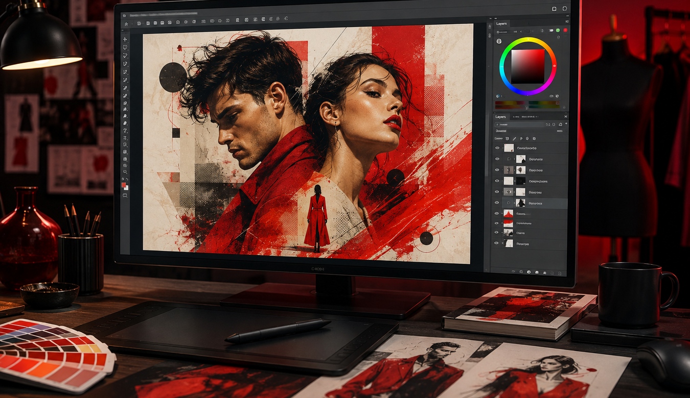
We often talk about design as if it were something added at the end: choose a colour, place the logo, make the page attractive, and call it finished. In 2026, that view is far too small. Professional graphic design is communication that reaches us before we have consciously decided what we think.
Think about food. We do not experience a meal only through its ingredients. We see its colour and presentation. We notice texture. Aroma creates expectation before the first bite. Contrast, temperature, sound, memory, and presentation all contribute to whether the experience feels fresh, comforting, exciting, luxurious, or disappointing.
Visual design works in a surprisingly similar way. Our minds consume colour, proportion, typography, photography, illustration, spacing, contrast, and movement. Those ingredients stimulate attention and emotion. Before someone reads your headline, they have already started experiencing your brand.
1. Design Is Something We Experience
A strong visual does not simply deliver information. It creates a sensation around that information. Deep, controlled colours can feel established and confident. Bright combinations can feel energetic. Generous white space can feel calm and premium. Dense layouts can feel urgent, technical, busy, or overwhelming depending on how they are handled.
This is why two businesses can communicate almost identical words and create completely different impressions. The words are only part of what the audience is consuming.
Design creates the emotional environment in which your words, products, and ideas will be interpreted.
2. Colour Has Enormous Communicative Power
Colour can attract the eye, establish hierarchy, separate information, support recognition, and create mood. A bold red can inject energy and urgency. Blue can feel stable or technological. Earth tones can feel natural and grounded. Black and white can create restraint, contrast, sophistication, or drama.
There is no universal formula where one colour always creates one emotion. Context, culture, shade, saturation, surrounding colours, industry, and personal experience all matter. Professional design works with those relationships instead of selecting a colour simply because it “looks nice.”
The most powerful colour systems also know when to stop. If everything screams, nothing gets heard. A controlled palette allows the important moments to have impact.
3. A Brand Is a Visual Meal
Imagine a beautifully prepared dinner. The chef considers balance: rich against fresh, soft against crisp, sweet against acidic. Presentation guides the eye and creates anticipation. Too much of one ingredient can overwhelm everything else.
A professional designer thinks in similar relationships. A heavy headline may need quiet space around it. A vivid photograph may need restrained typography. A powerful accent colour becomes stronger when it is not spread across every surface.
Design is composition. The ingredients matter, but so does the way they are combined.
4. Typography Gives the Brand a Voice
Typography is visual tone of voice. The same sentence can feel corporate, editorial, playful, luxurious, technical, historical, or informal depending on how it is typeset.
Professional typography goes beyond choosing a font. It considers size, weight, line length, spacing, contrast, hierarchy, readability, and how different typefaces work together.
In a world filled with generated content and reusable templates, typography is one of the places where thoughtful design can immediately make communication feel deliberate rather than generic.
5. Good Design Directs Attention
People rarely examine a website, brochure, advertisement, or social graphic with equal attention from corner to corner. Their eyes move. Strong design anticipates that movement.
Scale tells us what matters first. Contrast separates an action from its surroundings. Space groups related information. Imagery creates an entry point. Repetition establishes rhythm. The designer is effectively saying, “Look here first. Now this. Here is the detail. Here is what to do next.”
When that hierarchy is missing, the audience has to work harder. Confusion is rarely persuasive.
6. Professional Design Creates Perceived Value
Packaging can make the same type of product feel inexpensive or premium. A restaurant menu can make a meal feel considered before it reaches the table. A well-designed proposal can make the company presenting it feel more organized.
The same effect exists online. Consistent, thoughtful design signals that a business pays attention to detail. Poor alignment, random fonts, weak imagery, inconsistent colours, stretched graphics, and clutter can suggest the opposite — even when the actual company provides excellent service.
Design cannot manufacture trust on its own, but it can either support credibility or make the business work harder to earn it.
7. Why Professional Design Matters Even More in 2026
Businesses now have extraordinary access to templates, stock assets, automated layout tools, and AI-generated imagery. That makes creating something visual easier than ever. It also means audiences are surrounded by enormous quantities of visual material that can begin to look interchangeable.
The advantage of professional design is increasingly not the ability to place elements on a page. It is the ability to make decisions: what belongs, what should disappear, what the brand should feel like, what deserves attention, and how all of the pieces remain recognizably yours.
Tools can accelerate production. Taste, strategy, judgement, and understanding the audience still determine whether the result communicates effectively.
8. Consistency Turns Individual Designs Into a Brand
A logo alone is not a brand. A brand emerges through repeated experience. The website, social graphics, proposals, signage, advertising, presentations, email graphics, printed material, and photography should feel related even when they serve different purposes.
Consistency does not mean making everything identical. It means maintaining a recognizable visual language: colour relationships, typography, spacing, image treatment, illustration style, and tone.
That repetition builds familiarity. Familiarity makes recognition easier. Recognition helps a business stay in memory.
9. Design Gives Information Emotion
A spreadsheet can tell you the specifications of a product. Design can make you want to pick it up. A paragraph can explain a destination. Photography and typography can make you imagine being there.
This is where design becomes powerful. It connects rational information with feeling. A charity can communicate hope rather than statistics alone. A technology company can make complexity feel approachable. A professional service can feel established without becoming cold.
The emotional response should always be appropriate to the message. The goal is not manipulation. It is alignment between what the organization means and what the audience experiences.
10. How ANJ Design Approaches Visual Communication
At ANJ Design, graphic design is not treated as filling empty space. We look at the purpose of the piece, the audience, the brand, the environment in which it will be seen, and the response it should encourage.
That can mean developing a stronger visual identity, creating graphics for a website, designing marketing material, refreshing an outdated brand system, improving presentation consistency, or building a complete digital experience where graphic design and web design work together.
Colour should have a reason. Images should contribute. Typography should support the voice. Space should help the audience breathe. The finished design should not simply be attractive — it should feel appropriate, memorable, and unmistakably connected to the business.
11. Give People Something Worth Looking At
We live in a visual world. People scroll quickly, compare constantly, and make decisions surrounded by competing messages. Professional graphic design gives a business the ability to slow that moment down.
Like a memorable meal, great design is a combination of ingredients and senses. Colour creates appetite. Typography gives flavour. Imagery creates texture. Space provides balance. Composition determines how the experience unfolds.
When those elements work together, people may not be able to explain every design decision — but they feel the result.
That is the power of professional graphic design in 2026. It turns information into experience, businesses into recognizable brands, and ordinary communication into something people actually want to consume.
ANJ Design can help transform your ideas, colours, imagery, and message into a visual identity and digital experience designed to be noticed, understood, and remembered.